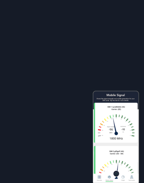
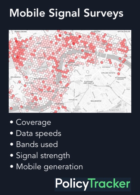
The Mobile Deployment Database (MDD) combines two independently collected datasets: Teragence’s network deployment data and the PolicyTracker Spectrum Database (PSD). Combined they show not only which mobile spectrum has been licensed in a given country, but the extend to which operators have made deployments in the bands.
Teragence network deployment data
This dataset is crowdsourced from a network of third-party Android apps that incorporate Teragence’s data-collection SDK. Readings are taken when the host app triggers them; the host app is responsible for obtaining user consent and the relevant OS location permissions before doing so. The dataset currently covers ~43 countries and is refreshed daily.
The SDK is distributed via a public GitLab repository, and Teragence states it complies with the Google Play terms and conditions.
From the device, the SDK captures location (latitude, longitude, altitude and the accuracy of each) and the serving and neighbouring cell measurements: network operator (MCC/MNC), radio access technology and the network type displayed to the user, signal strength and quality metrics (RSRP, RSRQ, SNR, RSSI, CQI), and cell identifiers (cell ID, tracking/location area code, physical cell ID and channel number), along with the device’s network registration state, the Android version, and, on supported hardware, whether the satellite modem is enabled. Collection is passive: the SDK observes the device’s existing radio state and does not generate traffic or run active speed tests.
Teragence does not collect any long-term persistent individual identifiers such as MAC address, IMEI, or advertising ID and is therefore GDPR compliant.
The core metric for this database is the sector count: the number of sectors in which a given operator’s radio equipment is transmitting on a specific frequency band and technology. A “sector” is the portion of a base station’s coverage served by a distinct set of directional antennas; most macro sites have three sectors, each covering roughly 120°. Sector counts are attributed to the operator even where a base station’s physical infrastructure is shared between multiple MNOs, and are broken down by technology (2G/3G/4G LTE, 5G NSA, 5G SA), frequency band, and urban versus non-urban location.
In the Mobile Deployment Database we typically refer to sector counts as the number of deployments, or the number of radios. (See entry in FAQs)
What services are covered?
The MDD only covers public cellular mobile networks i.e. mobile networks which can be used by domestic consumers. It does not cover private networks, which are typically used by businesses or public safety organisations; the use of mobile bands for fixed broadband services such as FWA; or services which cannot be received by standard mobile handsets e.g. Triatel’s specialist 450 MHz service in Latvia.
Defining urban areas
Urban areas are defined using the EU’s Global Human Settlement Layer (GHSL) “Urban Centre” classification, derived from Copernicus satellite data. This defines an urban centre as contiguous 1 km² grid cells with a population density of at least 1,500 inhabitants per km², forming a contiguous area with a total population of at least 50,000. Locations falling outside these delineated urban centres are classified as non-urban. This is the same “Degree of Urbanisation” methodology used by Eurostat and the OECD for EU statistical purposes.
PolicyTracker Spectrum Database (PSD)
The PSD is compiled by PolicyTracker from official regulator and operator announcements. It covers approximately 120 countries (this figure moves as coverage is added) and is updated quarterly. It records licensed and allocated spectrum by band, including the licensee, technical conditions attached to the licence, coverage obligations, expiry dates, and prices paid at auction or assignment.
Combining the two datasets
The datasets are matched by country, operator and frequency band, allowing users to compare what has been licensed against what has actually been deployed.
For example, identifying spectrum that is licensed but shows little or no measurable deployment. Because operator names are recorded differently across regulatory sources and network-measurement sources, this matching is reviewed and refined on an ongoing basis rather than being a fully static, one-time mapping.
How the data is used in practice
The table below gives an example from the underlying data, for the operator One in Albania:
Deployments for the operator One in Albania
Technology
Area
Band
Sector count/ Number of deployments
LTE
Non-urban
1800 MHz
1,472
LTE
Non-urban
700 MHz
67
LTE
Urban
1800 MHz
723
LTE
Urban
700 MHz
7
NR (5G SA)
Non-urban
1800 MHz
5
NR (5G SA)
Non-urban
700 MHz
26
NR (5G SA)
Urban
1800 MHz
9
NR_NSA (5G NSA)
Non-urban
1800 MHz
604
NR_NSA (5G NSA)
Non-urban
700 MHz
23
NR_NSA (5G NSA)
Urban
1800 MHz
442
Because a single sector will typically carry radios on more than one band simultaneously, these figures aren’t mutually exclusive; the 1,472 non-urban sectors carrying One’s 1800 MHz LTE signal, for instance, are likely to overlap heavily with sectors carrying other bands too.
Deployment share formula
From the sector count, PolicyTracker derives a deployment share metric for each operator, technology, and band combination:
Deployment Share (operator, band, technology) = [Sectors (urban) + Sectors (non-urban)] ÷ Total sectors for that technology (operator, country) × 100
Using the table above: One’s total 5G NSA (NR_NSA) sector count across all bands in Albania is 3,129. Its 1800 MHz NR_NSA deployment share is therefore:
(604 + 442) ÷ 3,129 × 100 = 33%
How the spectrum Cost vs Deployment index is calculated
The spectrum Cost vs. Deployment Index is derived from two metrics: the cheapness of the band compared to other mobile bands; and benchmarked against other operators proportionately how much has this company deployed the band?
The Cost vs Deployment Index combines spectrum acquisition cost and observed deployments, with equal weight given to each. Prices are are ranked relative to all operator-band combinations in the dataset and deployment is ranked relative to this bands’s share of total network observations. A higher score – close to 100% – indicates spectrum that was acquired relatively cheaply and is relatively heavily deployed.
The price_percentile field takes every Country + Operator + Band record in the joined dataset and ranks its spectrum price against every other record. The deployment_percentile compares the band’s share of all deployments by one operator against the same metric for all operators in the dataset.
Where an operator has bought a band more than once the USD/MHz/pop price is based on a weighted average, where larger holdings and greater population coverage carry more weight. This combined operator-band price gives us the price_percentile which is inverted to give the cheapness percentile,
The Cost vs Deployment Index is not influenced by the need to deploy more radios in high frequency bands to get the same coverage as the lower bands. The deployment_percentile is a relative measure assessing whether the MNO’s use of the selected band is more or less than its peers as a percentage of all the bands used in their networks.
The Cost vs Deployment Index can therefore be used to compare bands with different propagation characteristics. (See example 2 below)
Example 1: where a band has not been deployed
O2’s UK purchase of 26 GHz has a price_percentile = 0.0156 USD/MHz/pop that means its price is very close to the bottom of the distribution — among the cheapest 1–2% of operator/band holdings in this dataset. We then reverse that for the Cost vs Deployment calculation: cheapness percentile = 1 – 0.0156 = 0.9844 So it gets approximately 98.4/100 for cheapness.
The deployment percentile is calculated by ranking each operator-band combination against all the others based on the band’s share of that operator’s total observed deployment. As there is no deployment of 26 GHz then the band_share_of_operator_deployment = 0 and the ranking or deployment_percentile is also 0, meaning it has the joint lowest deployment share in the dataset
The Spectrum Cost vs Deployment Index is calculated like this:(cheapness_percentile + deployment_percentile) /2
In the UK 26 GHz example the Spectrum Cost vs Deployment index is 49% : (98.44 + 0) / 2 = 49.22
This is better value for money than paying considerably more for a band then not deploying it e.g. by 2026 German operator 1&1 had made no observable deployments in 2.1 GHz for which it paid 0.2420 USD/MHz/pop in 2021 . This is 15 times as much as O2 paid for 26 GHz so the 1&1 purchase is, so far, worse value for money. This is reflected in a lower Spectrum Cost vs Deployment score, namely 17%:
Example 2: comparing higher and lower mobile bands
It is not the case that Cost vs. Deployment Index gives higher scores for higher frequency bands which necessarily require the deployment of more radios because of their poor propagation characteristics.
The Cost vs. Deployment Index does not reflect the limited propagation characteristics of 3.6 GHz, which requires the use of more radios than 700 MHz. It is measuring not the absolute number of radios in a band but comparing the band’s share of all deployments by one operator against the same metric for all operators. It is therefore a relative measure.
For example, in the Netherlands Vodafone Ziggo’s 2.6 GHz radios make up 10% of the 4G and 5G network. This has a deployment percentile of 78%, meaning that this is a relatively large deployment: only 22% of operators are using this band more intensively. 10% is also the network share for O2’s use of 3.6 GHz in the Czech Republic, but this achieves a deployment percentile of only 21% because in relative terms it is not an intensive usage. For 79% of operators the band makes up a larger share of their network.
We can conclude that, compared to other operators, Vodafone Ziggo is making one of the most intensive uses of 2.6 GHz whereas O2 is making relatively little use of 3.6 GHz. This is irrespective of the number of radios needed for coverage in each band, it is based on how the operators’ network design compares with their peers.
In theoretical terms, covering a given area using the 3.6 GHz band would require approximately twice as many radios as using 2.6 GHz. But Vodafone Ziggo’s intensive use of 2.6 GHz gives a deployment percentile nearly four times that of O2 using the 3.6 GHz band (78% vs 21%) even though O2 needs to deploy a greater number of radios to achieve the same coverage. So the deployment of more radios does not determine the Cost vs. Deployment Index.
As shown in the table below, both 3.6 GHz and 2.6 GHz were relatively cheap (Percentiles of 80% and 95%) but the marked difference in relative deployment gives Vodafone Ziggo a much higher score in the Cost vs Deployment index, even though in absolute terms it has deployed half the number of radios. (8,927 deployments of 2.6 GHz were recorded for Vodafone Ziggo, compared to 18,476 for O2 in 3.6 GHz)
Operator
Band
Cheapness percentile
Deployment percentile
Cost vs. Deployment Index
O2, Czech Republic
3.6 GHz
80%
21%
50%
Vodafone Ziggo, Netherlands
2.6 GHz
95%
78%
78%
What the combined data can show
Some of the questions the database is designed to answer:
Whether services are actually being deployed in licensed spectrum
How deployment differs between urban and non-urban areas for a given band
Which bands are being used for 5G SA versus 5G NSA
Which legacy 4G bands are being refarmed for 5G
Which operators, within a country or across countries, have the strongest non-urban deployment in a given technology or band.