Training
Understanding Modern Spectrum Management
An overview of the key engineering, legal and policy issues
Read more
The data sources for tables, graphs and diagrams are given below with the titles of specific figures in bold. Methodology used on specific pages is explained in the last section.
The PolicyTracker Data Explorer displays graphics showing national data about the mobile bands presented alongside national statistics on demographics, the economy and connectivity. This gives a data-based picture for individual countries and also allows international comparisons.
The spectrum data comes from the PolicyTracker Spectrum Database (PSD) and the other information comes from recognised international sources, such as the World Bank.
The data has not been adjusted for factors such as inflation or present value but pricing data is converted to USD or USD/MHz/pop to facilitate international comparisons. This uses the exchange rate at the time of the award.
The Data Explorer gives a near-instant statistical overview but may not answer more specific research questions. However, it does give an indication of what data is available from PolicyTracker and elsewhere as well as how this can be adapted and compared.
PolicyTracker’s database contains global listings of the licenses held by operators, along with information about duration, prices paid and coverage requirements. The PSD does not include local licenses, such as those used for campus networks but it does include regional licenses which cover a substantial proportion of a country.
This means that the database is ideally suited to providing a spectrum usage overview in countries with national licenses. However, for India, the US and Australia, we have normalised spectrum licences by population to make the data more useful.
For the chosen country this give a snapshot of spectrum-related regulatory activity whether that is in the form of a consultation, development relating to a forthcoming award of spectrum or another issue.
The data is sourced from PolicyTracker’s consultations and auctions alerts services and also from our news articles.
The table on the left shows the 10 most recent licences issued in the chosen country, based on data from the PSD. This can be expanded to show all awards using the drop down at the top.
The table on the right shows bands which are expected to be awarded in the future, based on data from our auctions alert service.
The first graph shows the size of a country in km2 and the population. In the table at the bottom the population density is also given in inhabitants per km2 .
The next graph, Where do people live? (as % of total), shows what percentage of the population live in different settlement types, based on information from CIESIN (see above). This is best illustrated by comparing two or more countries, using the tickbox in the table at the bottom.
The examples shown below compare Afghanistan, a large land mass of 644,000 km2 with a population of 32.5 million, with Hong Kong, a small country of 1,073 km2 with a population of 7.3 million.
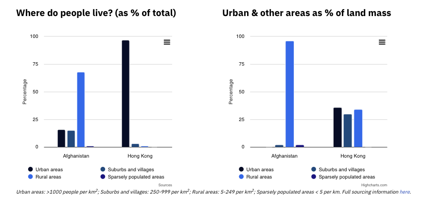
The left hand graph shows that 68% of the population of Afghanistan live in rural areas but in Hong Kong the picture is reversed with 1% of the population in rural areas and 97% in urban areas.
The right hand graph shows that rural settlements cover 96% of Afghani territory, while 34% of Hong Kong’s land mass is rural. The urban areas where 87% of the population live take up 36% of Hong Kong’s land mass, explaining its high population density of 6,833 people per km2, compared with 51 people per km in Afghanistan.
This is relevant to spectrum policy because it is much easier to achieve near universal population coverage for mobile in small countries like Hong Kong, where almost all the population – 7.1 million (97% of 7.3 million) – live in just 386 km2 (36% of 1,073 km2). To reach a similar number of people living in rural areas of Afghanistan requires coverage of about a third of rural areas or nearly 200,000 km2. This is over 500 times bigger than its Hong Kong equivalent, requiring many more base stations and much higher costs for mobile operators..
The PolicyTracker Spectrum Database (Pop Density by Category tab) offers a more granular categorisation of population density, subdividing both the rural and sparsely populated categories.
This page shows the national and near-national licences for mobile cellular services in a particular country. National is defined as licences covering >80% of country for low and mid-band licences and at least a major city for high band licences.
The band ranges are defined as follows:
An overlapping category of sub 3 GHz spectrum is used for the pie chart as this covers the established mobile bands which are generally issued in 10-20 MHz blocks rather than the block sizes of up to 100 MHz used in 3.3-3.8 GHz. The sub 3 GHz range is a good way to make a quick comparison of overall holdings.
Please note that a small number of the licences holders do not offer a consumer service, so they are not MNOs in the sense of operating a public telecoms network.
This page is shows how comparatively expensive spectrum awards are in a particular country, or in a small group of countries. The linked example above shows awards in Belgium since 1995, but could be expanded to include other countries or filtered for particular bands using the checkboxes in the table at the bottom.
Spectrum licences are grouped to determine both the total revenue raised in each award and the cost of spectrum sold in different frequency bands. To calculate USD/MHz/Pop, each licence’s price is weighted by both the amount of MHz assigned and the population coverage of that licence. This ensures that larger licences—covering broader areas with more spectrum—have a proportionally greater impact on the average price than smaller, localised licences. By using this weighted approach, auction results remain comparable across national and regional awards, preventing distortions caused by unusually large or small spectrum blocks.
The prices are the total amounts paid for a given band in an award, not the amount paid for individual licences. These have not been adjusted for inflation or other factors. They are shown in USD and calculated using exchange rates at the time of the auction. Global averages are based on all the award entries in the PSD which have USD/MHz/pop figures. These date back to 1995.
In the example above, the first graph shows that a total of over USD 593 billion was paid for 1800 MHz licences in Belgium’s 1995 award, whereas USD 245 billion was paid for the same band in the 2022 auction. The second graph shows that the 1995 prices were 0.53 USD/MHz/pop, which is 252% of the global average USD/MHz/pop for 1800 MHz. The 2022 award was 0.4 USD/MHz/pop or 117% of the global average.
The table at the bottom gives the award data in exportable numerical form as well as additional information such as award types: the 1995 award was a beauty contest and the 2022 award was an auction.
The top two graphs shows World Bank data in absolute numbers for GDP and GDP per capita on the left; and for percentage of ICT goods in total imports and exports of goods on the right.
The bar chart at the bottom uses the same dataset but it is displayed in relative terms, based on a ranking of the country’s position out of the 89 nations for which data is available.
For the chosen country this give a snapshot of spectrum-related regulatory activity covering consultations by regulators of other bodies, forthcoming awards or other policy issues.
The data is sourced from PolicyTracker’s consultations and auctions alerts services and also from our news articles.
The table on the left shows the 10 most recent licences issued in the chosen country, based on data from the PSD. This can be expanded to show all awards using the drop down at the top of the table..
The table on the right shows bands which are expected to be awarded in the future, based on data from our auctions alert service.
The data on this page is derived from the Current Assignments section of the PSD, where those licences cover at least 80% of the country.
In the USA, Australia and India, which predominantly use regional licences, the methodology used to calculate relative spectrum holdings is different to that used in the other countries in our database where nearly all assignments are national. A full explanation is available here.
The table at the top allows the selection of four countries. The charts below then display the national spectrum holdings for all operators with a licence in the mobile bands where this is used to offer services to the public. This means that MNOs joint venture holding companies will be displayed, as well as FWA or WISP players with a residential offering, but companies who only offer B2B services will not appear.
Pie charts showing sub-3 GHz holdings in each of the four countries are displayed. first. Sub-3 GHz is often used as the easiest single measure of mobile spectrum as it covers the “traditional” mobile bands where block sizes are similar i.e. 20 MHz or less. Licences in 3.3-3.8 GHz and above are often 80 MHz or more, giving a distorted picture.
Operators holdings are then displayed in four graphs using different metrics:
This page shows national figures for the totral amount of apectrum assigned in different categories, the number of operators and how evenly the spectrum is distributed.
The first graph shows the total low, mid and high band mobile spectrum assigned in each country.
The second graph, Number of operators and how evenly spectrum is distributed, shows the number of operators holding spectrum for public mobile servies and proportion held by the each operator in each country. The Spectrum Distribution Index column gives an indication of how close each country is to an equal distribution of sub-3 GHz spectrum. Sorting this column give a quick guide to the most equal and unequal distributions.
The Spectrum Distribution Index is calculated by summing the difference – in percentage points – between each operators’ sub-3 GHz holdings and what would have been an equal share. This is then divided by the number of operators. If all operators had equal shares the Index would be 0; a very asymmetric distribution would be over 30.
For example, if four operators had 20%, 30%, 40% and 10% of sub- 3 GHz spectrum respectively, then each is deviating from the equal share of 25% by 5%, 5%, 15% and 15% respectively, giving a Spectrum Distribution Index of 40/4=10.
The table at the bottom shows the figures used to generate the two graphs above. It can be sorted and filtered to benchmark against different metrics.
An overview of the key engineering, legal and policy issues