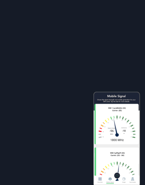
Training
Understanding Modern Spectrum Management
An overview of the key engineering, legal and policy issues
Read more
There are now two new tabs covering population density, as well as an existing tab just giving total population:
There are some differences between the datasets: please see below.
The population density and population count data comes from Colombia University and NASA (more details below) and this was manipulated in a Geographic Information System (GIS) (ArcMap v10.3).
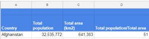
a) Calculating total population
Pop density ranked tab
The National Identifier Grid, v4.10 (2010) was used to delineate the national borders of each country. The total population given in both population sheets (see example on left) was calculated by summing the population values of all pixels from the UN WPP-Adjusted Population Count,v4.10 (2015) map contained within a country’s national border. The total area of the country was then calculated and is given in square kilometres in column C. Column D is a approximate calculation of the overall population density of each county, calculated by dividing column B by C.
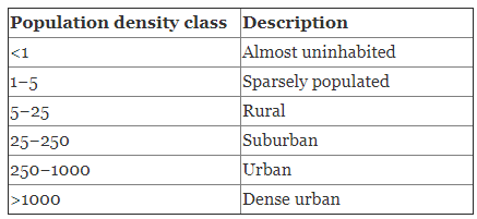
Population density categories
b) Population density categories
The national borders of each country were used to separate the global UN WPP-Adjusted Population Density, v4.10 (2015) map into population density maps for each country. Population density values were then categorised using the values shown in the table.
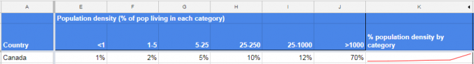
In the Pop density by category tab columns E to J (shown below) represent the percentage population living in each density category. Note that percentages are given as whole numbers which causes some countries to have values of 0%; in these instances the percentage population is too small to be rounded to 1%.
Column K is a crude line graph to help visualise the population distribution given in columns E to J, typically increasing left to right for developed nations. The Canadian example below shows that most of the population lives in urban areas.
Population density by category tab (left hand side)
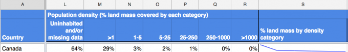
Columns L to R (below) give the percentage area covered by the population density classes for each country. Column L sums the percentage area where population data could not be collected. Column S is crude line graph to help visualise the areal distribution of the population density classes.
For example, the line graph below shows that, unusually for a developed country, most of Canada’s landmass is uninhabited while a tiny area contains its urban and dense urban conurbations.
Population density by category tab (right hand side)
Our population data comes from the leading global source, the Gridded Population of the World, Version 4 (GPWv4) data sets provided by the Center for International Earth Science Information Network (CIESIN) at Columbia University, USA
This gives estimates of population density (people per km2) which are globally comparable as well as population count estimates (actual number of people). The population density and count data used in our maps and tables are estimates for the year 2015, consistent with national censuses and population registers from the 2010 round of censuses, which occurred between 2005 and 2014. This population data was collected from hundreds of national statistical offices and other organisations around the world. Previous census data was used to calculate annualised population growth rates which was used to estimate population counts for the target year 2015.
More information about GPWv4 and links to download its 9 data sets can be found on NASA’s Socioeconomic Data and Applications Center (SEDAC) website. Details about the basic methodology and data collection techniques used to create GPWv4 are given in this document.
GPWv4 was created from two basic data inputs; non-spatial population data (i.e. tabular counts of population listed by administrative areas of nation-states) and administrative boundary data. Population estimates for each administrative area were distributed over a ~1km grid, however, the distribution is not even but instead weighted by area of individual grid cells. This is because in order to project population estimates globally, a global coordinate system (mercator projection) is required, however, this increasingly distorts the size of objects the further they are north or south of the equator, typically most overestimating the size of Greenland and Antarctica. The same effect occurs to the grid cells meaning grid cell area is not 1km2 all over the world. Population values assigned to each grid cell within an administrative area is a function of the population estimate for the administrative area and the landmass contained within the grid cell, this is known as an areal-weighting method.
The precision and accuracy of a given grid cell (pixel) is a direct function of the size of the input areal unit (administrative area). For nations with large input units, the precision of the population values assigned to individual grid cells will be lower compared to individual grid cells with a smaller input unit. Therefore, for precise analysis, study areas should be larger than input areas contained within it. To allow users to do this, global mean size (km2) of input areas is provided at ~1km resolution as ancillary data, and can be downloaded here. To ensure the highest possible level of precision, population estimates were made only for countries where the size of our study areas (the area covered by each population density category) was larger than the mean size of input units within it.
You will notice small differences between the national population figures used in the old Pop Data tab and in the two new population density tabs. This is because:
We do not believe the differences are statistically significant and decided to continue using the existing World Bank data for the MHz/pop calculations because this is updated more regularly. This approach also gives a greater consistency to our MHz/pop figures
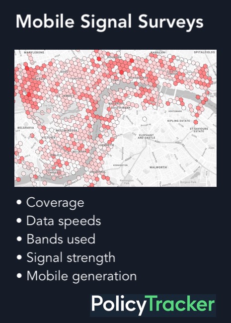
An overview of the key engineering, legal and policy issues