SRS: Spectrum Research Service: methodology for diagrams (Archive – Old Database)
This article explains how the data in the Spectrum Research Service is collected and the parameters used to create the diagrams and tables
The graphics in the 4G section are derived from raw data in the PolicyTracker Spectrum Database (PSD), the world’s most comprehensive listing of assignments, pricing and allocations. Please note:
- This covers over 120 of the biggest economies, but not the whole world
- The list of countries is below
- It only covers bands used for mobile or wireless broadband services
- The charts below are based on the issuing of licences:
- if an operator holds two separate licences issued at different times, this will be counted as two licences
- …even though they may be both in the same band and used congruently
General points about the graphs
- The scale may vary: when comparing one graph against another please note that the left hand axis may differ. For example very few countries have allocated 2.3 GHz to mobile, so the scale on the graph representing this has a maximum value of 3 whereas in a popular band like 2.1 GHz the scale goes to 25.
Specific points about the individual diagrams:
Pie chart: usage by ITU region
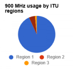
- Shows the total number of licences in this band in the PSD in XXX MHz
- Counts the number in the three ITU regions
- The pie chart shows these number as percentages
- There may be more XXX MHz licences around the world in countries not covere dby the PSD
- However, this chart gives an accurate representation of the relative proportions
Bar chart: regional usage by technology
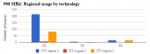
- Shows the number of licences used for 2G,3G and 4G in the ITU regions
- As above only includes licences in the PSD; licences from smaller countries are not included
- However, it gives an accurate impression based on a large sample
Bar chart: usage by technology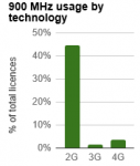
- Counts the number of licences in this band used for 2G, 3G and 4G
- Divides that figure by the total number of 2G, 3G and 4G
- Gives that proportion as a percentage
- As above, most countries are covered but not all
Map: use of a band in the major economies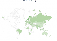
- Shows the countries where this band is licensed
- Hovering over the country shows how many licences have been issued
- As above, most countries are covered but not all
Bar chart: pricing for a band since a particular date
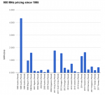
- Shows the one-off price paid in $/MHz/pop using exchange rate at time of auction
- Includes all assignment methods where a one-off fee was charged
- Licences will not be included if:No one-off fee was charged
- Information is incomplete e.g. issue date it not known
- Licences bought in combinatorial auctions are omitted unless the price for the individual band is indisputable
Bar chart: average MHz/pop for all mobile auctions
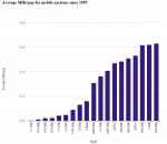
- Only includes auction prices as these are the more reliable figures
- Shows average prices for all bands in the the PSD
- Calculates the average price paid for a band in each auction then averages all these prices
- Licences will be omitted for the reasons given above
Pie chart: which bands does a particular operator use?
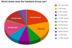
- This is based on a count of the number of licences
- Hovering over each slice shows the count and the percentageof the total
- e.g. Vodafone holds 29 1800 MHz licences around the world, which is 21.3% of the total number
Map: an operator’s global licences
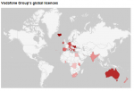
- This shows the amount of spectrum in MHz held by an operator in a country
- Hovering over the country shows the amount of spectrum held
- The amount show is total paired and unpaired spectrum
- N.B. A 5 MHz paired licences is counted as 10 MHz
Table: The national mobile licence holders
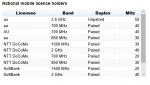
- This appears in the countries section
- It shows the licences owned and the amount of spectrum held by the major mobile players
- In some countries with regional licences (e.g. the US) there can be scores of mobile operators, some of whom offer only very localised services
- This chart removes local operators by only counting those licences which cover 40% or more of the country
- In some cases with many regional licences (e.g.India) 30% has been used in order to give a better picture which operators are nationally active
- Licences above 3 GHz are not included in this table as these are not suited to offering national services
- The MHz column shows the total amount of spectrum held in a particular band: e.g. if the operator has several 1900 MHz licences it shows the total spectrum for all of them
- Please note:
- A company may hold a national licence but may not be offering services
- Some of the licences shown may not give national coverage
List of countries in the PSD